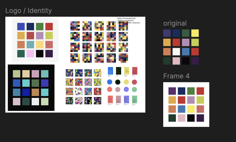
An ongoing collection of experiments in visual encoding, interaction, and information structure—testing different ways of making data easier to explore and understand.
What I'm TestingVisual encodingInteraction patterns
FormatOngoing experimentsSmall, focused studies
ToolsD3.jsJavaScriptFigmaObservable
This collection is a working library of data visualization patterns: small experiments built to isolate one question about clarity, comparison, navigation, or interpretation.
Each artifact tests how a change in encoding, interaction, or information structure can make complex data easier to explore and understand.
What I'm investigating
How chart form, hierarchy, annotation, filtering, and motion influence what people notice first—and how confidently they can move from overview to detail.
How the collection works
Each study begins with a narrow question, compares one or more approaches, and records the tradeoffs. The goal is a reusable set of patterns rather than a single finished product.
How I judge a pattern
A strong pattern makes the intended comparison apparent, preserves context during interaction, and reduces explanation without hiding uncertainty or complexity.
Current lines of inquiry
Comparison - making differences and trends easier to scan.
Exploration - helping people move between overview and detail.
Explanation - using hierarchy and annotation to guide interpretation.
01Comparison LayoutsEncodingStructureTesting layouts for clear comparison across categories and time.Practiced: Small multiples, shared scales02Overview to DetailInteractionStructurePreserving context as readers inspect individual values.Practiced: Linked views, focus and context03Direct AnnotationAnnotationEncodingReducing the distance between marks and their explanation.Practiced: Direct labels, annotation hierarchy04Filter FeedbackInteractionStructureMaking the effects of filtering visible and understandable.Practiced: Filter states, transition feedback05Uncertainty CuesEncodingAnnotationShowing confidence and missingness alongside the main signal.Practiced: Uncertainty bands, missing-data states
Comparison Layouts
EncodingStructure
TypePattern Study
Year2026
StatusIn progress
A study of aligned views, small multiples, and overlays for comparing values across categories and time.
Practiced: Small multiples, shared scales, visual hierarchy