
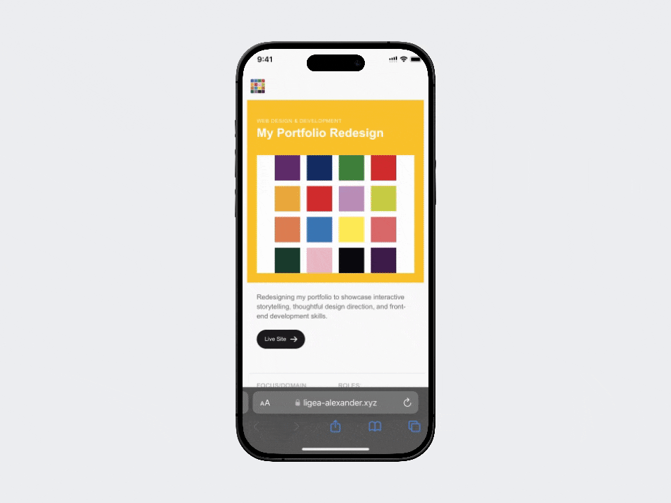
Redesigning my portfolio to showcase interactive storytelling, thoughtful design direction, and front-end development skills.
Live Site ↗A Site That (Better) Represents Me
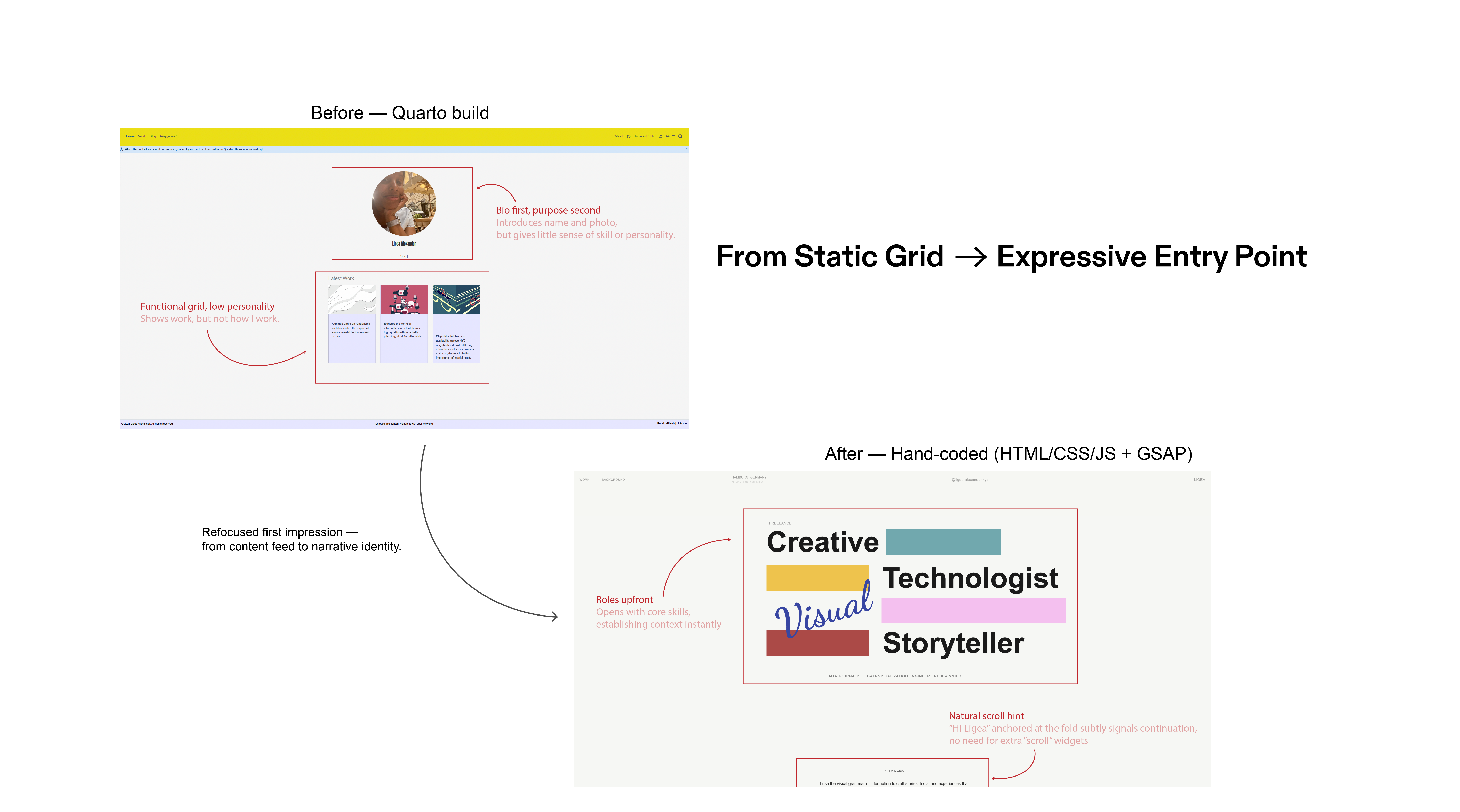
My previous portfolio was functional but flat, a simple grid that showed projects without much character. It didn't communicate how I work or the kind of experiences I aim to create. I've always believed you can sense how a creator thinks from the moment you encounter their work; long before reading an About page. My old site failed that test.
Like many, I leaned on quick, out-of-the-box tools to get something online. For me, that tool was Quarto - appealing for its speed and its growing use among people working across data science, analytics, and storytelling..
That first site served its purpose, but I needed a portfolio that would:
- Showcase my skills in frontend development, animation, and design thinking
- Express my perspective as a creative technologist; blending narrative, interaction, and code into something cohesive.
The redesign became a self-briefed client project: define the goals, shape the direction, and build a site that reflects who I am now, not who I was when I first coded a portfolio.
Shaping the Direction
The redesign wasn't just a rebuild, it was a reskin. Quarto is fast and provided me with a quick solution, but it also limited my ability to control design, interaction, and identity.
        Old Portfolio ──> Functional | Fast-build | Tool-dependent (Quarto)
                             │
                             ▼
        New Portfolio ──> Interactive | Narrative | Hand-coded Identity
This time, I wanted to think about design, development, and storytelling as one system rather than separate layers.
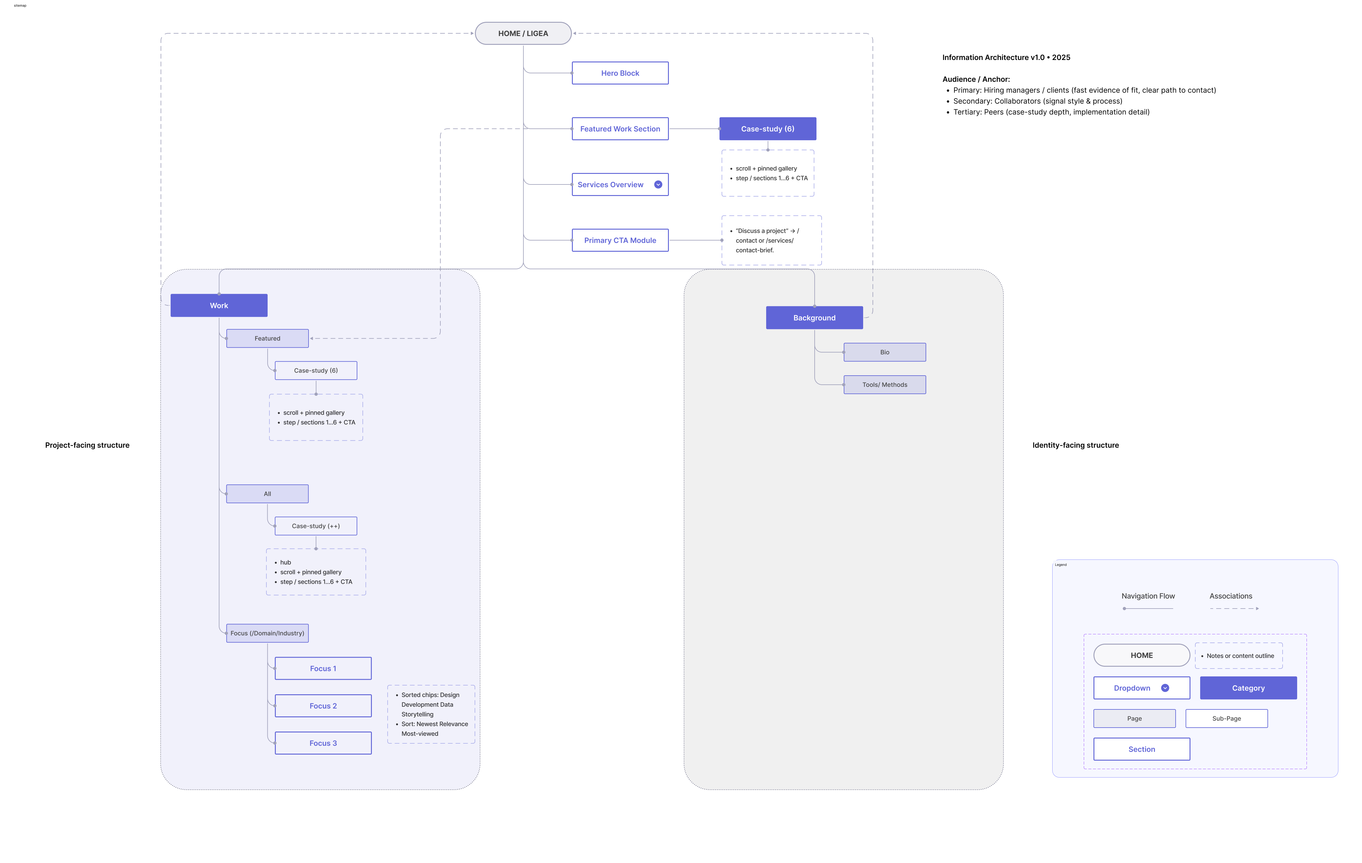
From Notes to Framework
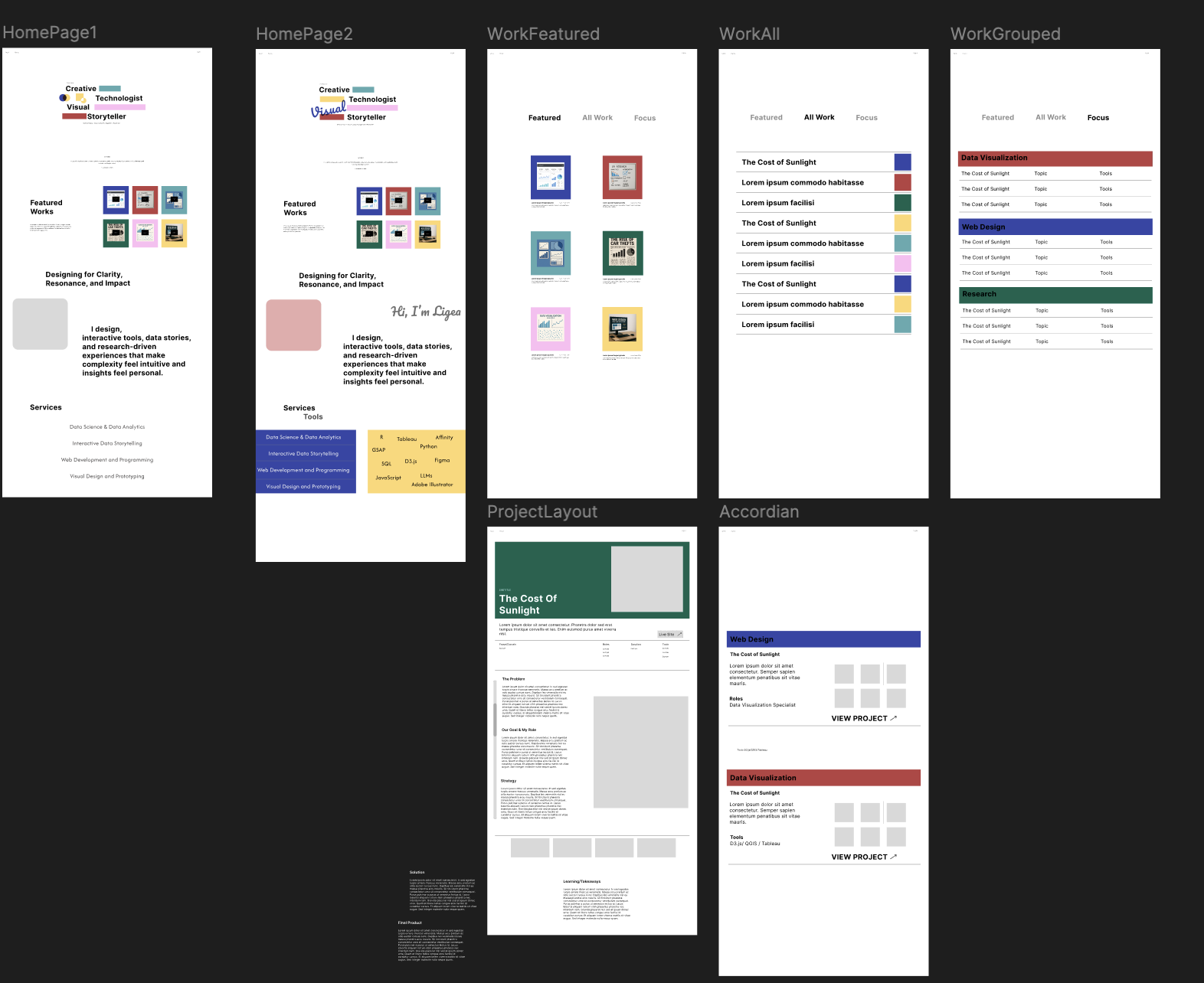
I started on paper, outlining exactly what each page needed to do. Writing instead of designing helped me focus on purpose before polishing structure, flow, and what each section should communicate.
Once things were on paper, I got deliberate about what I needed:
- Featured Work: deciding how many projects to highlight and how to balance variety with depth.
- Services: outlining what value I offer and how to communicate it clearly.
- Work Pages: planning how different project types (data, dev, storytelling) should live on the page and 'feel'.
These notes became my low-fidelity frames in Figma. Once the structure was sound, I began layering in rhythm and behavior, how sections would move, reveal, and guide attention.
Throughout the process, I held my audience in mind:
- Potential employers and clients — people evaluating what I can build and how I think.
- The right kind of collaborators — those drawn to clarity, experimentation, and narrative.
- Peers — fellow designers, developers, and data storytellers interested in process.
Every design decision had to serve one of these groups — balancing personality with professionalism, and aesthetics with usability.
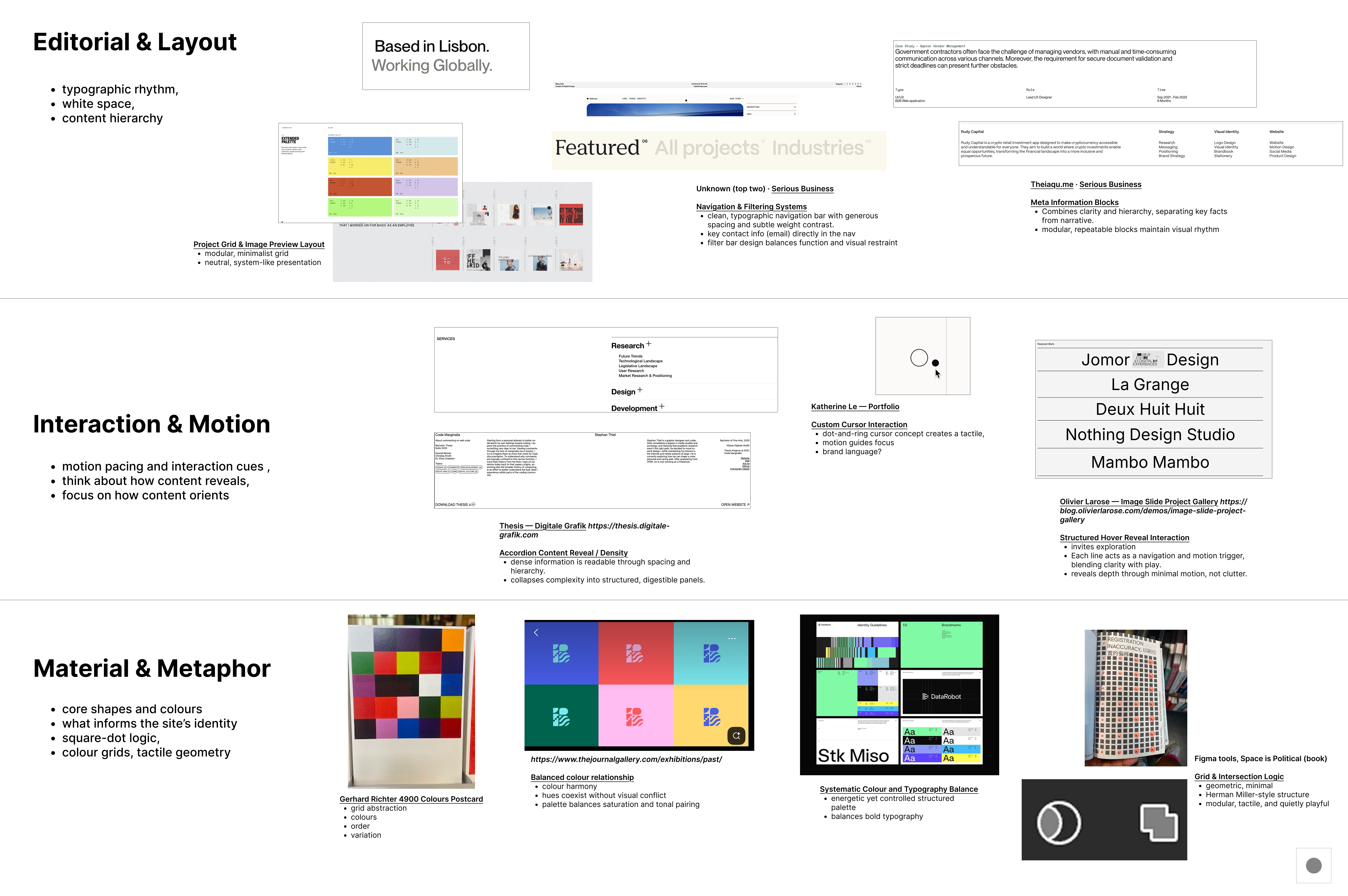
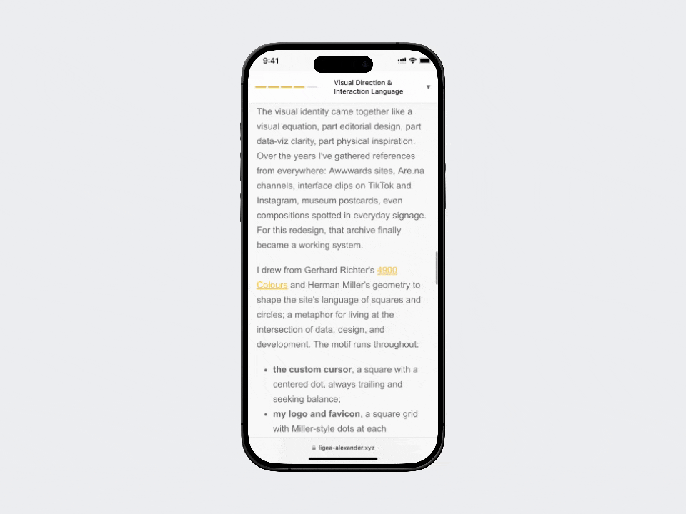
Visual Direction & Interaction Language
The visual identity came together like a visual equation, part editorial design, part data-viz clarity, part physical inspiration. Over the years I've gathered references from everywhere: Awwwards sites, Are.na channels, interface clips on TikTok and Instagram, museum postcards, even compositions spotted in everyday signage. For this redesign, that archive finally became a working system.
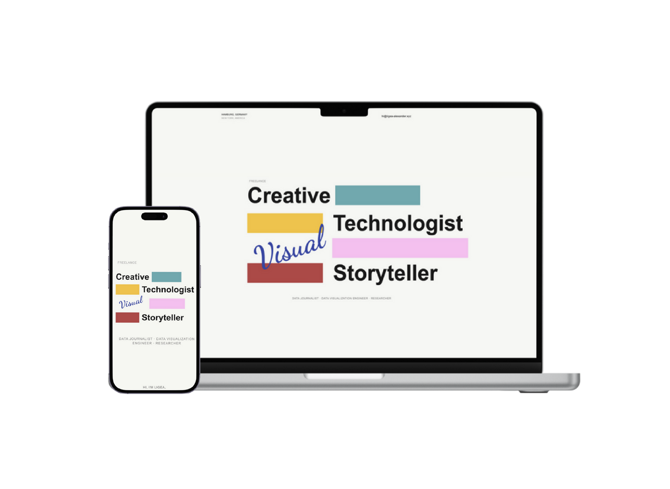
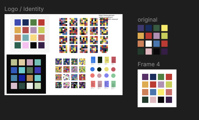
I drew from Gerhard Richter's 4900 Colours and Herman Miller's geometry to shape the site's language of squares and circles; a metaphor for living at the intersection of data, design, and development. The motif runs throughout:
- the custom cursor, a square with a centered dot, always trailing and seeking balance;
- my logo and favicon, a square grid with Miller-style dots at each intersection; and the square-dot relationship itself, inspired by the rudimentary forms of data, '0' and '1'.
Every interaction supports this overall idea. Subtle GSAP animations guide attention, while hover and scroll cues stay purposeful, not flashy. The goal was just a site that feels easy to move through.
Visually, I focused on clarity with motion: clean type, open space, and animation that helps users stay oriented. Every movement signals hierarchy and keeps the story flowing.
Structure & Storytelling
This site was designed as a reading experience, not just a portfolio. Every section - from the Work page to the case studies - needed to feel guided, structured, and intentional.
The Work page centers on hierarchy and orientation. Visitors can view projects by Featured, All, or by Focus / Domain / Industry, reflecting how different audiences browse: recruiters by focus, peers by craft, and clients by relevance. The goal was to give each group a clear path through the site without losing narrative flow.
I've always disliked endless-scroll portfolios that bury the point, so I designed a structure that respects time and attention. Each case study unfolds in clear, digestible steps, with visuals pinned beside the text to maintain context.
GSAP powers a scroll-spy navigation rail that pins to the left on desktop, tracking progress as users move through the story. On mobile, it collapses into a top progress bar, maintaining orientation without clutter.
Assets
Click on any image to explore it in detail with navigation and captions; use arrow keys or navigation buttons to browse through the gallery.
Reflection
Designing and building this portfolio taught me to think like my own client, balancing story with usability and narrative with performance. It's not just a site that shows my work; it acts like my work - interactive, structured, and aware of its audience.