Hamburg, Germany

New York, America

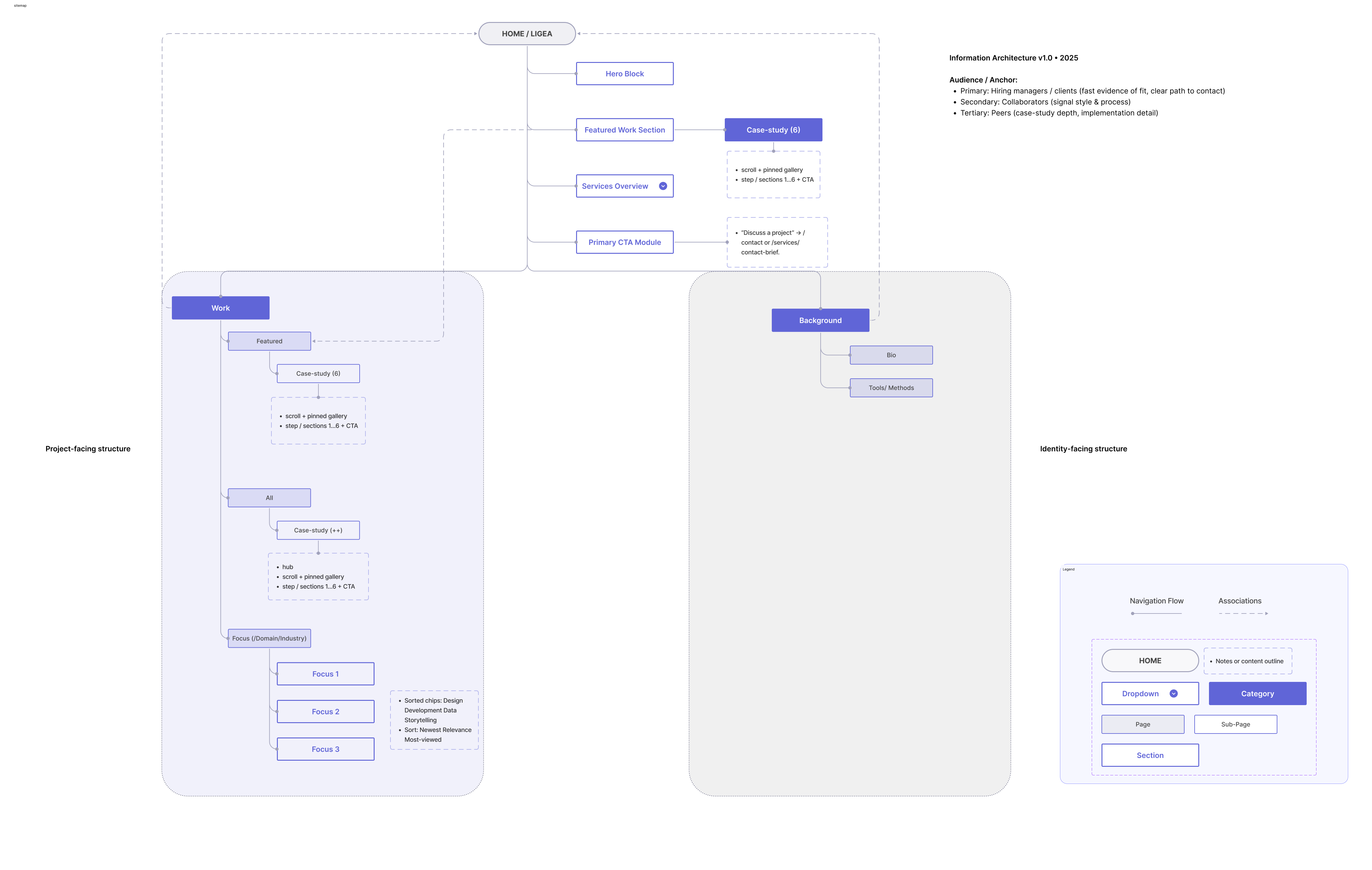
Home Work Background
Studio Log / Collection

TouchDesigner

Artifact preview 1
Artifact preview 2
Artifact preview 3
Artifact preview 4
Artifact preview 5
Artifact preview 6
Artifact preview 7
Artifact preview 8
Artifact preview 9

Explore my TouchDesigner experiments and interactive visual systems.

Jump to Collection
Focus/Domain Creative Coding Interactive Visual Systems
Skills I'm Building Real-time pipelines Signal mapping + visual rhythm
Constraints Weekly sprint cadence Tool-limited prototypes
Tools TouchDesigner GLSL + OBS + JS

This collection showcases my evolving experiments, short sprints, and multiple outputs in creative coding and interactive visual systems. I document my process and learnings along the way.

Each artifact is a snapshot of my learning journey, reflecting the intersection of technical execution and aesthetic quality.

Scroll to Explore
• 4 artifacts
01 Sales Pipeline Sankey ChartsAnalytics Multi-stage funnel tracking conversion across 8 sales touchpoints. Practiced: D3.js, SVG path math, Recharts Sankey
02 Urban Heat Island Map MapsAnalytics Choropleth of surface temperature variance across 12 metro areas. Practiced: Mapbox GL JS, GeoJSON processing
03 Particle Flow System MotionTouchDesigner Real-time particle simulation driven by audio amplitude input. Practiced: GLSL shaders, TouchDesigner CHOP networks
04 Dashboard Analytics Suite ProductAnalytics Modular dashboard with KPI tiles and cohort drill-down tables. Practiced: React component patterns, Recharts
05 Dependency Network Graph ChartsProduct Interactive node-link diagram for cross-team dependency risk. Practiced: D3 force simulation, edge bundling
06 Mobility Route Sandbox MapsProduct Scenario planner comparing route efficiency under live constraints. Practiced: Routing APIs, geospatial indexing
07 Signal Cascade Wall MotionTouchDesigner Audio-reactive ribbon system with layered motion fields. Practiced: TOP/CHOP pipelines, GLSL displacement
08 Retention Cohort Lens AnalyticsCharts Temporal cohort explorer for retention decay comparisons. Practiced: SQL cohorts, small multiples
09 Forecast Planning Board ProductAnalytics Planning surface with KPI forecasts and scenario annotations. Practiced: Uncertainty bands, dashboard composition
Sankey artifact preview

Sales Pipeline Sankey

ChartsAnalytics
TypeChart
Year2024
StatusComplete

Multi-stage funnel tracking conversion across 8 sales touchpoints with configurable stage weights and drill-down by rep.

Practiced: D3.js, SVG path math, Recharts Sankey

View on GitHub

Patterns & Takeaways

Design / Analysis Patterns

  • Signal + rhythm wins - Combining Perlin noise with amplitude mapping creates organic but controllable motion.
  • Small multiples win - For comparing categories over time, small multiples beat color-coding every time.
  • Temporal data needs motion - If data changes over time, motion communicates better than static encoding.
  • GPU first for scale - GPU instancing unlocks dense particle fields without frame drops.

Mistakes I Keep Catching

  • Masking sparse data - Animation can hide weak data quality instead of revealing it.
  • Skipping null states - Empty and error states still need visual logic.
  • Export breaks hierarchy - Axis labels and annotations often collapse at final output size.
  • Legend mismatch - Legends without direct labels force unnecessary cognitive load.

Reusable Snippets

  • D3 scale factory - Shared scale helpers reduce chart-to-chart drift.
  • WebSocket reconnect hook - Lightweight retry logic stabilizes live telemetry views.
  • Map camera utility - One transition helper keeps map interactions consistent.
  • Responsive SVG viewBox hook - Preserves readability across breakpoints.

Next Focus

  • Canvas at scale - Push beyond 100k points without interaction lag.
  • Annotation layer - Build collaborative notes directly in the viewport.
  • Accessibility pass - Improve chart contrast and keyboard paths.
  • Automated OG generation - Produce clean social previews from artifact metadata.